Colours
Primary colours
The blue has been chosen as the primary colour. Its unique and rich hue makes it a popular choice for the brand looking to create a modern, warm and friendly aesthetic.
Chathams Blue
#0E4971
14, 73, 113
97, 67, 31, 18
7693 C
Lochmara
#007ACA
0, 122, 202
84, 45, 0, 0
2172 C
Lochmara 1
#0087E0
0, 135, 224
79, 41, 0, 0
2382 C
Tropical Blue
#DCEEFA
220, 238, 250
16, 1, 0, 0
6148 C
Pattens Blue
#EBF8FF
235, 248, 255
10, 0, 0, 0
656 C
Secondary colours
The secondary colours serve to complement and enhance the blue shades. When applied properly, they highlight the key elements and add visual appeal. This combination creates a clean and elegant look.
Limeade
#305200
48, 82, 0
79, 43, 100, 44
2266 C
Limeade 1
#4D8400
77, 132, 0
73, 25, 100, 11
2278 C
Christi
#629D0E
98, 157, 14
67, 15, 100, 2
2277 C
Chrome White
#E4F0D3
228, 240, 211
14, 0, 23, 0
7485 C
Frost
#F4FAEB
244, 250, 235
6, 0, 11, 0
621 C
For the optimal printing outcome, we suggest consulting with your selected print agency. They can help identify the ideal colour settings to make sure your project comes out just as you imagined.
Neutral colours
The neutral color scheme is mainly used for backgrounds and fonts. Use the intensities to create a visual hierarchy between primary and neutral/secondary sections allowing the other color families to stand out and provide a purpose. However, be mindful of the contrast requirements.
Mine Shaft
#262626
38, 38, 38
Dove Gray
#555555
85, 85, 85
Gray
#888888
136, 136, 136
Athens Gray
#E6EAEF
230, 234, 239
Athens Gray 1
#F0F2F5
240, 242, 245
White
#FFFFFF
255, 255, 255
Adobe colour swatches
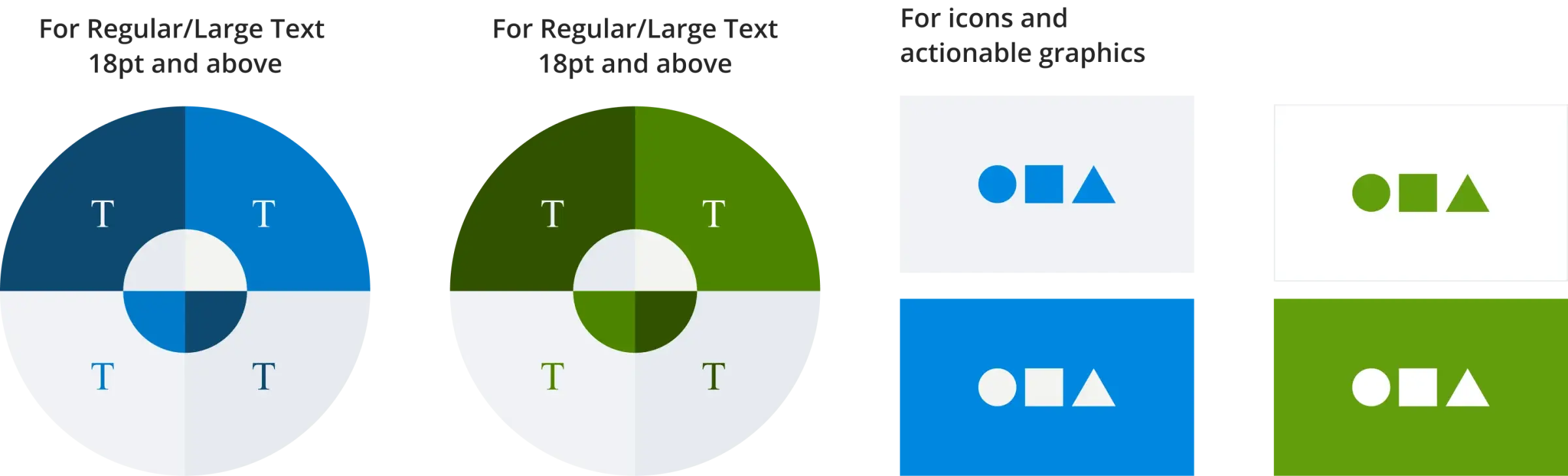
Colours usage
We aim to make content more accessible. The key aspect is to ensure that the colour combinations are consistent to improve readability for the visually impaired. In this case, we recommend the following colour combinations regarding text and graphic elements over the background colour.