
Product icons
The product icons have been developed to cater for navigation purposes in online solutions and it serves as the main visual cue and identity element of each product.
Download here

Primary colours
Chathams Blue
#0E4971
14, 73, 113
97, 67, 31, 18
7693 C
Lochmara
#007ACA
0, 122, 202
84, 45, 0, 0
2172 C
Lochmara 1
#0087E0
0, 135, 224
0, 135, 224
2382 C
Tropical Blue
#DCEEFA
220, 238, 250
16, 1, 0, 0
6148 C
Pattens Blue
#EBF8FF
235, 248, 255
10, 0, 0, 0
656 C
Secondary colours
Limeade
#305200
48, 82, 0
79, 43, 100, 44
2266 C
Limeade 1
#4D8400
77, 132, 0
73, 25, 100, 11
2278 C
Christi
#629D0E
98, 157, 14
67, 15, 100, 2
2277 C
Chrome White
#E4F0D3
228, 240, 211
14, 0, 23, 0
7485 C
Frost
#F4FAEB
244, 250, 235
6, 0, 11, 0
621 C
Colours usage
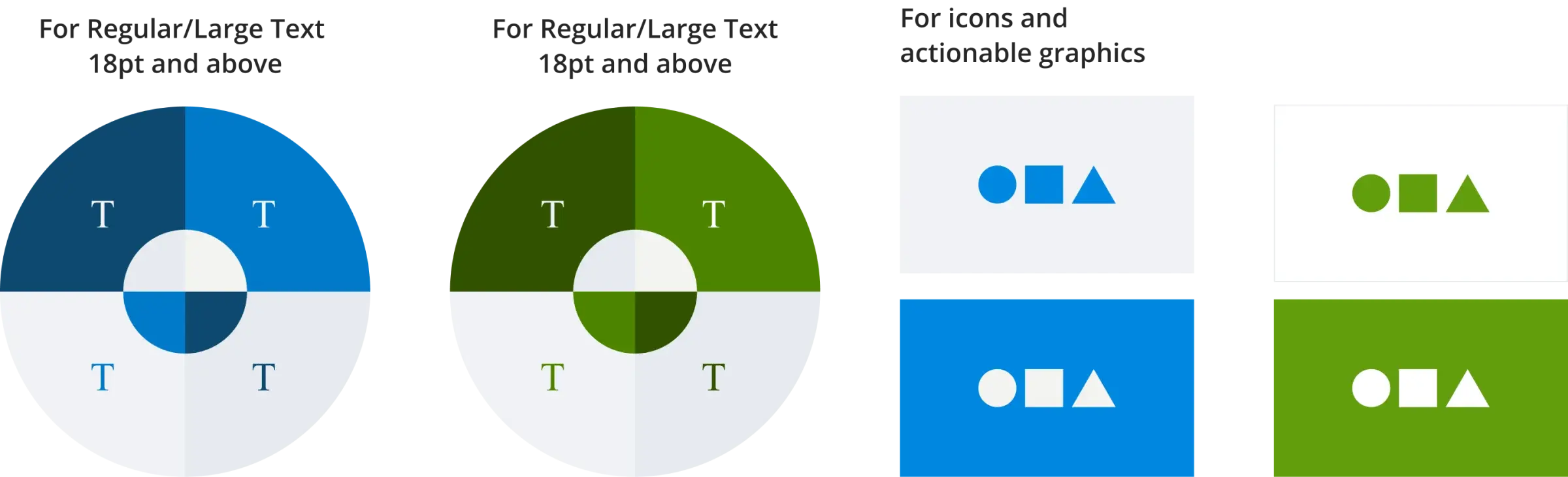
We aim to make content more accessible. The key aspect is to ensure that the colour combinations are consistent to improve readability for the visually impaired. In this case, we recommend the following colour combinations regarding text and graphic elements over the background colour.
Brand elements
The graphical elements are essential for creating and maintaining a consistent brand identity across various platforms.
