Choose language
Brand Guidelines
Updated: mars 18, 2026

Logo

Display mode

Logo is the primary identifier of the brand and a vital part of the visual expression. It consists of the combination of two essential elements that represent the product brand - logomark and wordmark. The logo must be legible when it has to be displayed on different contrasting backgrounds. In this case, we recommend using the logo variations on the light and dark backgrounds as shown below.

Logo GAT

Logo - Light background

Logo GAT (1)

Logo - Dark background

Layout

We’ve established two clear display layouts that stay consistent. The horizontal and vertical logo options offer flexibility for various spaces and uses.
Logo GAT

Logo - Horizontal display

Logo GAT vertical

Logo - Vertical display

Logomark

The logomark can explain the brand without words. Use the logomark when the name Gat is already visible, such as "profile" images on social media.
Logo GAT (3)

Logomark - Light background

Logo GAT (4)

Logomark - Dark background

Logo by VISMA

There are certain rules to follow when creating a profile within the Visma family. These rules are mandatory and must be followed to create a strong and consistent link to the Visma values. In the examples below you can see how the Gat logo can leverage the Visma brand and use the "by Visma" tagline.
by Visma logo light

Logo by VISMA - Light background

by Visma logo dark

Logo by VISMA - Dark background

Favicons
We use the favicon icons to assist users in identifying a website among various open tabs or saved bookmarks. They usually appear in the browser tabs, in bookmarks and in other areas where the website is displayed.
Logo GAT

Get the favicon assets from this package

App icons

Most of the time we need a little help to be able to identify an application and perform tasks on the mobile phone. This help is often represented by graphic elements that provide visual communication about the mobile app or brand without the need to elaborate in words. App icons are among the most crucial communication tools and play a significant role in promoting the app on both the App Store and Google Play.
App icons

Get the app icon assets from this package

Dos & Don'ts

It’s essential to retain consistent and correct use of all our logos to create a unified expression that builds brand awareness and protects the trademark. In general, do not alter any of the logos in any way. The following examples show potential misuse and simple directions to observe.
light-bg
Do

Place basic version on light background.
Logo GAT
Do

Place the dark mode version on the dark background.

Logo GAT (1)
Do

Maintain the aspect ratio when resizing.

Logo GAT (2)
Do

Always respect the minimum area.

Logo GAT (3)
Don't

Recreate the logo.

fczzNPPA8Ds4BJ8Ps4tq
Don't

Add taglines or other texts within the logo safe area that don't comply with the style guide rules.
logo dont
Don't

Distort or warp the logo in any way.

Logo GAT (4)
Don't

Rearrange the logomark and wordmark in the logo.

Logo GAT (5)
Don't

Use low contrast and low legibility when placing a logo on a background.
4jv5D56KEJUbtLKGrRrk
Don't

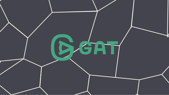
Place the logo on a noisy background. Always make sure the logo is readable.

Download

The logo assets are available in the Library.