
Logo

Display mode
Logo - Light background

Logo - Dark background
Logomark

Logomark - Light background

Logomark - Dark background
Do
Use the Multi as the wordmark based on the design provided.
Don't
Lorem ipsum dolor set amet
Monochrome version
Logo - Mono, Light background

Logo - Mono, Dark background
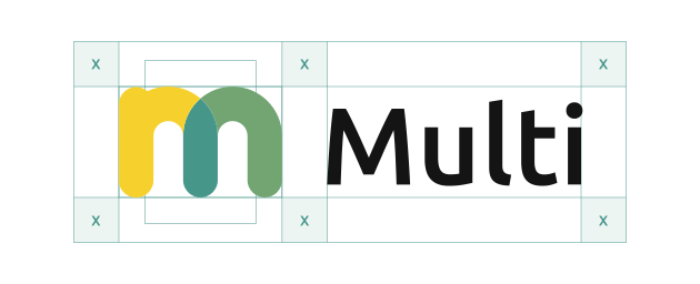
Safe area
Logo by VISMA
Logo by VISMA - Light background
Logo by VISMA - Dark background
Vignette

Favicons
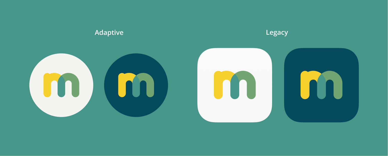
App icons
Dos & Don'ts
Do
Place basic version on light background.
Do
Place the dark mode version on the dark background.
Do
Maintain the aspect ratio when resizing.
Do
Always respect the minimum area.
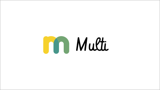
Don't
Recreate the logo.

Don't
Add taglines or other texts within the logo safe area that don't comply with the style guide rules.
Don't
Distort or warp the logo in any way.
Don't
Rearrange the logomark and wordmark in the logo.
Don't
Use low contrast and low legibility when placing a logo on a background.

Don't
Place the logo on a noisy background. Always make sure the logo is readable.