
Logo versions
Logo is the primary identifier of the brand and a vital part of the visual expression. The logo must be legible when it has to be displayed on different contrasting backgrounds. In this case, we recommend using the logo variations on the light and dark backgrounds as shown below.

Logo - Light background

Logo - Dark background
Clear space
Keep the area around the logo free of text, images, and other elements so it stays legible and unmistakable. The minimum clear space, marked X below, equals the full height of the logotype.
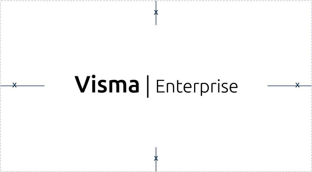
Never let another logo, headline, edge of page, or busy graphic enter this zone. When in doubt, give the logo more room, not less.
Dos and Don'ts

Do
Place basic version on light background.
Do
Maintain the aspect ratio when resizing.

Do
Always respect the minimum area.

Don't
Distort or warp the logo in any way.

Don't
Recreate the logo.

Don't
Use low contrast and low legibility when placing a logo on a background.